MPAT Editing
Choose a Navigation Model
Description:
MPAT currently provides three different navigation models that can be used to navigate the pages of your HbbTV App:
- Website: classical website-like navigation using links to navigate through the pages
- SlideFlow: specific navigation for storytelling purposes; strictly one-directional (vertical/horizontal) and similar to Pageflow navigation with large visuals
- TimeLine: Usable for on-demand or broadcast video, this model defines the appearing and disappearing of components (images, texts, links, etc.) with the help of timed events (StreamEvents).
These have to be defined before you can preview an MPAT site/HbbTV App.
Howto:
- In the left menu bar select MPAT -> Application Manager
- Select Navigation Model
- Select Save Changes
Create a Page Layout
Description:
The Page Layout defines the layout of a page of the HbbTV App without defining and including any media content. Every Page Layout that is being published can be used for building new pages. There is a grid which helps editors scale and position objects in 10px steps. The grid can be made visible by ticking the box SHOW GRID LINES.
Howto:
- In the left menu bar select Page Layouts
- Select Add New or select an existing Page Layout from the list
- If Add New: Enter a name for the Page Layout, e.g. * Layout First Page *
- Load a background image: To facilitate the positioning of the Component boxes, you can select a background image. As soon as you save the Page Layout, the image will disappear; it is only used for designing the Layout. Choose background image by adding the image URL or uploading a file via Select File
- Add and position boxes on the screen: These boxes are layout placeholders for the content components that can be defined later in the process when defining pages.
Tip: The upper left corner of each box shows its size (Width/Height) and position (From left and from top) in pixels. If you click into this box, you can enter size and position instead of dragging the box manually.
Tip: If you drag one box over another, the lower box is being repositioned. To avoid this click on the pin in the upper right corner of the box. Now its position is fixed.
- Save the Page Layout by clicking the button in the upper right corner.
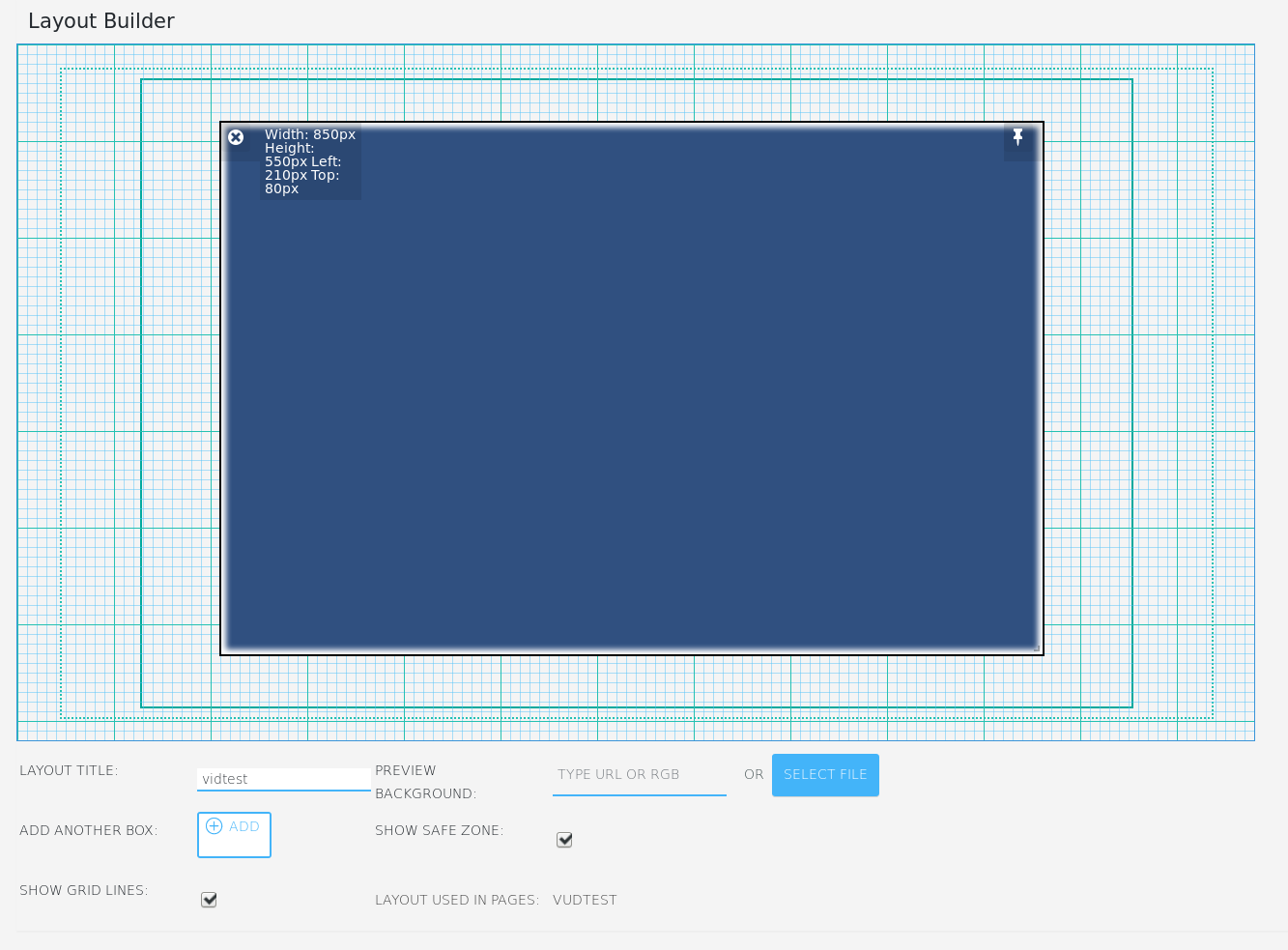
Layout Builder – View for a new Page Layout with size and position displayed
Create a Page
Description:
The actual Pages of an HbbTV App can be created with the help of a previously defined Page Layout. This way, the general concept of an HbbTV app can be defined using Page Layouts and specific media content can be adapted per page without breaking the application.
Howto:
- In the left menu bar select Pages
- Select Add New or select an existing page from the list
- If Add New: Enter a name for the Page underneath the Page Preview, e.g. our First Page
- Select a PAGE LAYOUT from the drop-down list; the selected page layout will appear in the Content Editor’s preview window
- Select a background image by adding the image URL (if the file is already available online) or uploading a file via Select File. Tip: If you want to use one background image for all pages of this application, you can define this in the Customizer. This is highly recommended, because TV devices usually don’t cache such images, so that they have to be loaded for every page which slows down the app. If you have defined a “global” background image, you can still define a background image for the current page, if you want it to be different here.
- Customize the content components: The Content Editor canvas shows the selected page layout with the boxes being shown as content components. Each content component has two parameter icons
- Pen (top left) – to further define the content for this component
- Gear wheel (top right) – to define that this component will have the Focus (active element) when the page is loaded first
- If Pen was selected, the following parameters can be set:
- Choose COMPONENT TYPE - Open the drop-down list and choose the type of content that is going to be displayed by the component (i.e. text, image, audio, video, etc.)
- Navigable – Checkmark, if you want to enable users to navigate to the component; for example, if you have chosen a video component, you might want to navigate to the component with the remote control to start and stop the video by selecting OK
- Component Style – Select Edit… if you want to define a certain style for this component (e.g., border, background color, text color, etc.).
- All other settings depend on the content component that was chosen.
- Save the page using the button at the top right of the browser window - as in all other applications, frequent saving is recommended. The page has now become part of your application.
- If this is the first page that you have created you may not see it when you test on a TV set. You will have to define your first page as the start page in the Application Manager.
To preview changes to a page, you can open the PAGE LINK and the page of the HbbTV App will be shown in the browser.
Howto use specific Components in a Page
MPAT-Plugins brings a bundle of different HbbTV related Components. How to add a Component to a Page is described in the section above. Here you will find, how to setup a specific Component for your application. Just choose one Component on the list and find a short tutorial on how to edit this Component to your preffered settings.
- Audio
- Broadcast
- Clone
- Data
- Gallery
- Image
- Launcher
- Link
- List
- Menu
- Red Button
- Scribble Live
- Scrolled Text
- Text
- Toggle Tracking
- Video
Create a Hotspot
Description:
A hotspot is an interactive icon that can be used to show additional information like text, video or audio. Accordingly, three types of hotspot icons exist, text, video and audio, as illustrated in Fig. 5-3.

Figure 5‑3: Hotspot Icons
The general idea of a hotspot is to add it as additional information on top of a larger image, for instance.
Howto:
- In the left menu bar select Page Layouts
- Select an existing page layout or create a new one
- Add a box that shall contain the hotspot
- Update the page layout to save it
- In the left menu bar select Pages
- Select an existing page or create a new one
- Choose the previously prepared page layout that contains a box for an hotspot
- Scroll down to the Content Editor
- Customize the content component >> click on Pen
- Choose a component (text, video, audio)
- Select navigable
- Select hotspot
- Customize the hotspot, i.e., choose colors, add text or links to the media data
- Update the page to save it
Configure the Navigation
Define a Start Page
Description:
You have to define the first page of your HbbTV app, i.e. the Landing Page of your website-style application or the actual first page of your SlideFlow application. In an hmtl setting this would be the index.html.
Howto:
- In the left menu bar select Appearance >> Customize
- Select Frontpage
- Choose the first page of your application from the dropdown list
Add a Menu to Connect Pages
Description:
Individual or even all pages can be selected through a menu component in order to jump to the pages immediately. A menu is a content component that has to be added as a box when creating the page layout (Create a Page Layout) and be defined as a content component Menu when creating the page (Create a Page).
Howto:
-
In the left menu bar select Pages
- Select an existing page from the list
- Scroll down to the Content Editor
- Go to content component that will contain the menu and select Pen
- In the Content Editor widget go to Choose Component and select Menu
- Configure the menu by
- Add a URL OR
- Select a page at Pages
- Add a Label. The label should consist of a (page) name and a number, that of the remote key, so that users know which key they have to press to jump to the page.
- Select a Remote key. This key can later be pressed on the remote control to jump to the page directly.
- Scroll to the Publish editor item (top right) and update the page.
- In the Content Editor widget select Back.
Add Links to Connect Pages
Description:
Pages can be connected by links in order to navigate to them. This is in particular required when you your application implements the website navigation model and consists of more than one page. A link is a content component that has to be added as a box when creating the page layout (Create a Page Layout) and be defined as a content component Link when creating the page (Create a Page).
Howto:
-
In the left menu bar select Pages
- Select an existing page from the list
- Scroll down to the Content Editor
- Go to content component that will contain the link and select Pen
- In the Content Editor widget go to Choose Component and select Link
- Select Navigable
- Configure the link by
- Adding an image: Type Link Image URL or Select Link Image
- Adding a label: Type Link Label
- Adding the Link URL: Type Link URL
- Scroll to the Publish editor item (top right) and update the page.
- In the Content Editor widget select Back.
Define the Order of Pages (SlideFlow only)
Description:
You have to define the first page of your HbbTV app, i.e. the Landing Page of your website-style application or the actual first page of your SlideFlow application. In an hmtl setting this would be the index.html.
Howto:
- In the left menu bar select MPAT >> Application Manager
- Verify that the selected Navigation model is Pageflow (should be SlideFlow)
- Define the order of pages at Pageflow pages order (exclude pages that should remain invisible).
Customize the Application
The options described here are provided by the Appearance menu and have an effect on the overall MPAT site. Individual changes to the elements of an MPAT page can be made when configuring the content components under Component Style (see also Create a Page).
Customize Links
Description:
MPAT provides different options to customize the appearance of links.
Howto:
- In the left menu bar select Appearance
- Select Customize >> Theme Settings >> Links
- Change the color at Edit Selected Border Color
- At the top of the menu select Save & Publish
Focus & Active Elements
Description:
In an HbbTV application you navigate with the arrow keys of your Remote Control. If the application contains interactive elements like videos, links, etc., these have to be selected (navigate to them with the arrow keys) and activated (press OK) to interact with them, i.e., start the video or jump to the link). As a visual orientation it is recommended that the active component has a border to give the user visual feedback on which element is currently in focus or out of focus.
Howto:
- In the left menu bar select Appearance
- Select Customize >> Module Settings
- Change the color at Edit Selected Border Color
- At the top of the menu select Save & Publish
Publish the Application
Description:
As soon as all pages are published, the application will be published as well.
Howto:
-
In the left menu bar select Pages
-
Verify whether a page has been published in the list in the Date column