Scrolled Text Component
General
The Scrolled Text Component will display a longer text including different defined styles.
These styles can be set globally in the Customizer. If you want to change a style for the
scrolled text component only for a specific box, please use the COMPONENT STYLE feature.
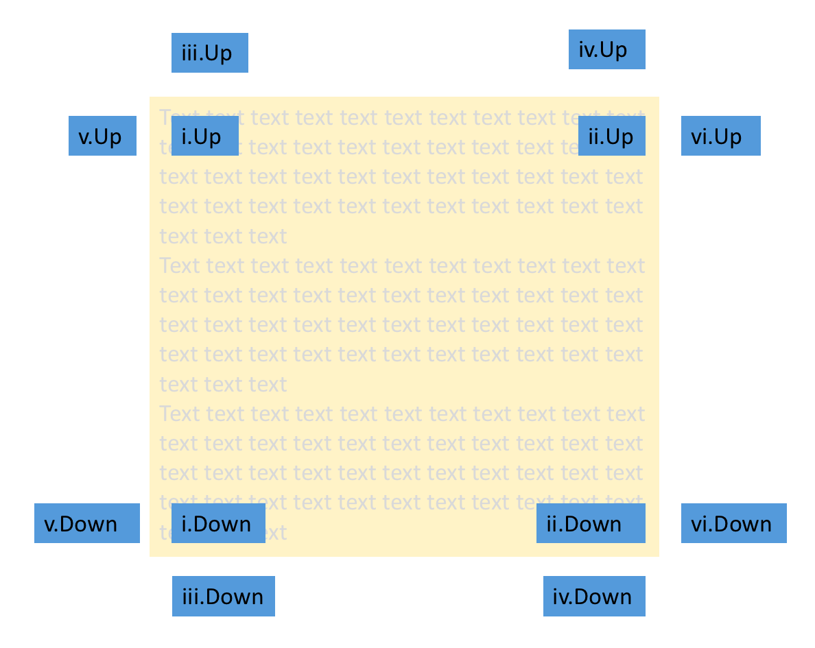
The scrolled text component may display arrows up and/or down. If the arrow down (resp. up) is shown, it means that there is hidden text below (resp. above) the component.
Settings
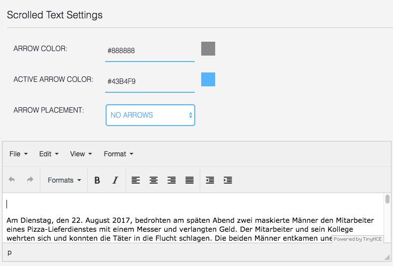
Settings include:
- the color of the arrow
- the active color of the arrow, i.e. the color when text is hidden
- arrow placement:
- on text, left (i.e. inside the rectangle where the text is rendered, on the left)
- on text, right (i.e. inside the rectangle where the text is rendered, on the right)
- above/below, left (i.e. above/below the rectangle where the text is rendered, on the left)
- above/below, right (i.e. above/below the rectangle where the text is rendered, on the right)
- outside, left (i.e. outside the rectangle where the text is rendered, on the left)
- outside, right (i.e. outside the rectangle where the text is rendered, on the right)
- no arrows (arrows are hidden)
Scrollbar
It is possible to have a scrollbar on Scrolled Text components. This may look like the picture below:
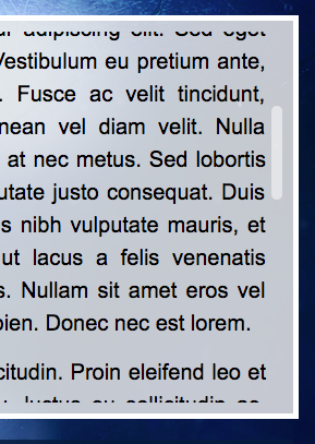
The style of the scrollbar is driven by the CSS class MPATScrolledTextScrollBar in the mpat-theme file style.css.
Another CSS class called MPATScrolledTextWithScrollBar allows the text not to be overlapped by the scrollbar.
The two classes are by default:
.MPATScrolledTextScrollBar {
  position: absolute;
  right: 0;
  width: 10px;
  background-color: rgba(255, 255, 255, 0.5);
  border-radius: 5px;
}

.MPATScrolledTextWithScrollBar {
  padding-right: 15px;
}
To have scrollbars overlapping the text:
.MPATScrolledTextScrollBar {
  position: absolute;
  right: 0;
  width: 10px;
  background-color: rgba(255, 255, 255, 0.5);
  border-radius: 5px;
}

.MPATScrolledTextWithScrollBar {
}
To remove scrollbars, change style.css to:
.MPATScrolledTextScrollBar {
  background-color: transparent;
}

.MPATScrolledTextWithScrollBar {
}