Red Button Component
General
The Red Button Component is a plain “red button” component, i.e. a symbol that appears shortly after the page is displayed, triggers another page if the red button is pressed, and disappears after some time.
Settings
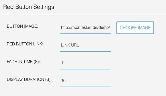
Red Button Settings include:
- the image of the button,
- the link of the red button, i.e. the application that is triggered if the red button is pressed,
- the fade-in time, i.e. the time after the page starts to be displayed when the button shall appear,
- the display duration of the red button image
